
Color Theory is the study of ideas that drive our choices and preferences in color. Red is one of the most interesting colors when it comes to how a color really affects us.
(View all of Robyn’s color studies here!)
In general, there are all kinds of reasons why colors make us feel the way they do. Blues may be soothing to some, but depressing to others. Orange can be warm and homey, or garish and tacky. Yellow can feel bright and joyful or it can trigger a sense of nervousness and anxiety. The way color affects us is generally based on our geographic region, our cultural heritage, and our personal experiences.
Red is one of the exceptions. It is a color that has a fairly universal impact on us as humans. In nature, red is a color of warning and danger. It’s the color of blood, and fire. It’s a color that sparks intense feelings of energy, and excitement. It’s a color that will always catch the eye, and it is believed we are biologically predisposed, as humans, to immediately take notice of the color red.
Psychological studies have been done that show that men, in particular, are drawn to the color red and tend to look at images of similar objects longer when the object is red (compared to other colors.) Don’t worry ladies, if you’re feeling a little left out, we apparently fixate on the color purple (in particular lavender hues) and tend to prefer the way we look in rooms with lavender paint. So we’re just as susceptible to the strange twists of our biological makeup!
In Bath Bombs red seems like it should be pretty straight forward. After all, for Lakes we have Red 40. Not only does it have the word Red in the name, it looks red, unlike that outlier Red 27 which looks like hot pink.
Do I really have the nerve to write a whole blog post on how to achieve the color red when all you need to do is dump some Red 40 in there? Well, yes and no. Because most people are terrified about the staining capabilities of reds, and to be fair, they aren’t wrong. Red, it seems, lives up to its reputation of being dangerous and exciting. If you haven’t dyed your tub pink at least once, then you’re not living!
One of the problems with Red 40 is that, while it can make the water a strong orangey-red color, the bath bombs themselves tend to lack that snappy bright tone we generally think of as being true red. Red 40, when used solely to obtain a red color, produces finished product that is slightly dingy and off-tone.
Red 27 on the other hand has the opposite problem. Most of you probably think of this color as pink, when it is in fact Magenta. Nuance aside, Red 27 makes bubble-gum pink water and some 80’s worthy neon tones in finished product.
So what can you do? You want a nice bright red, but you don’t want to stain your skin, your tub, or your washcloths. You don’t want to sell something that is pink when it’s supposed to be red, and you want the finished product to be vibrant and true to expected color standards.
Well my friends, you’ve come to the right place.
The first answer to this is going to be color blends of course. If you’ve read any of the other Color Study blog posts, then you know that I like to work with ratios. Ratios are a simple way to express how many parts of one thing there are to another. The reason I like to work with ratios is that they are easy to scale up or down. Each of the sample batches I show contain 250 g of bomb mix. You can add more color according to the scale of your mix.
If you’re needing a good supplier, I like to get my lakes from (affiliate link) MakeYourOwn.buzz.
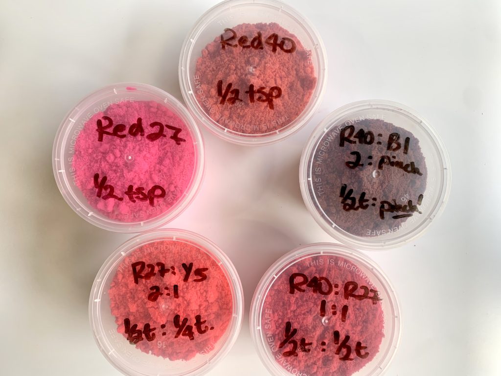
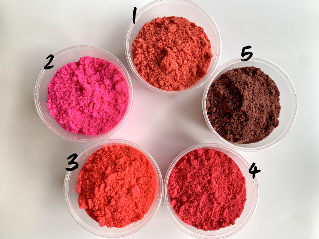
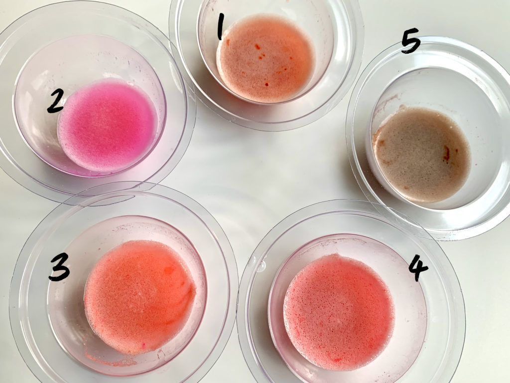
Mix 1: Red 40 at ½ tsp
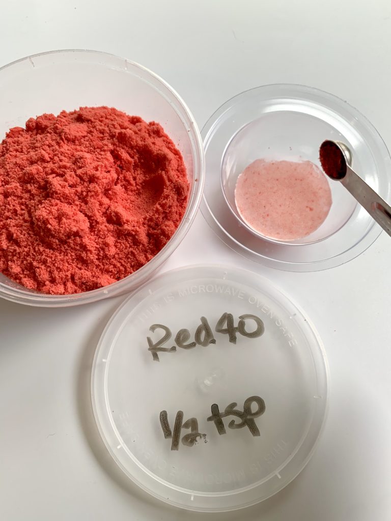
Red 40 by itself is a fairly good red. It has less problems with staining and fading than Red 27, but finished bath bombs tend to come out dull and the finished water has an orangey tint that doesn’t deliver that true red pop most makers are looking for.
Mix 2: Red 27 at ½ tsp
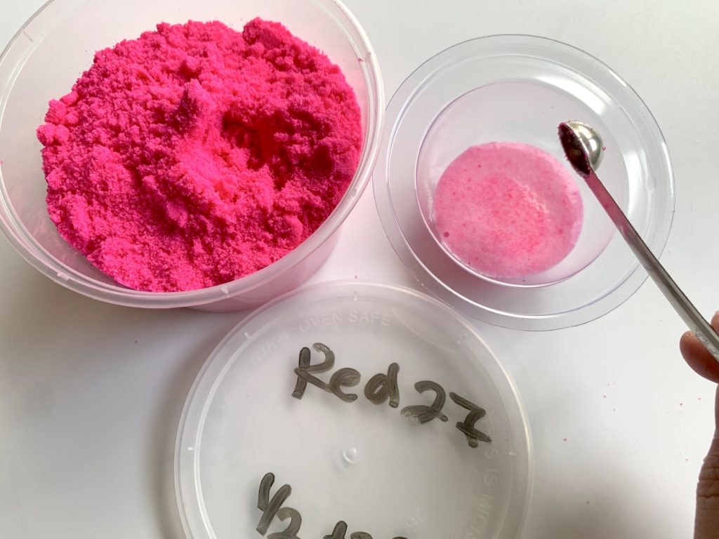
Red 27 by itself is such an intense shade of pink that there’s no pretending that this will work on it’s own for a true red. It is also the most UV sensitive of the Lake colorants and it can stain even in small doses. Because of that I try to never use more than ½ tsp in my full size batches.
Mix 3: Red 27:Yellow5 2:1
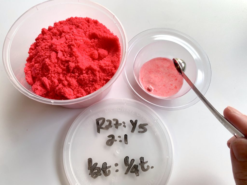
If you thought Red was a primary color then you might be surprised to learn that it’s not. At least not in the CMYK version of color used for dyes and pigments (for more about that you can read these color study articles!). If red was in fact a primary color it wouldn’t be possible to create it by mixing two colors. However you can see that this color blend of Red27 and Yellow5 creates a fire engine red! The end water tends to have a slight pink tone to it. If you want to combat that, try adding a bit more Yellow5
Mix 4: Red 40:Red27 1:1
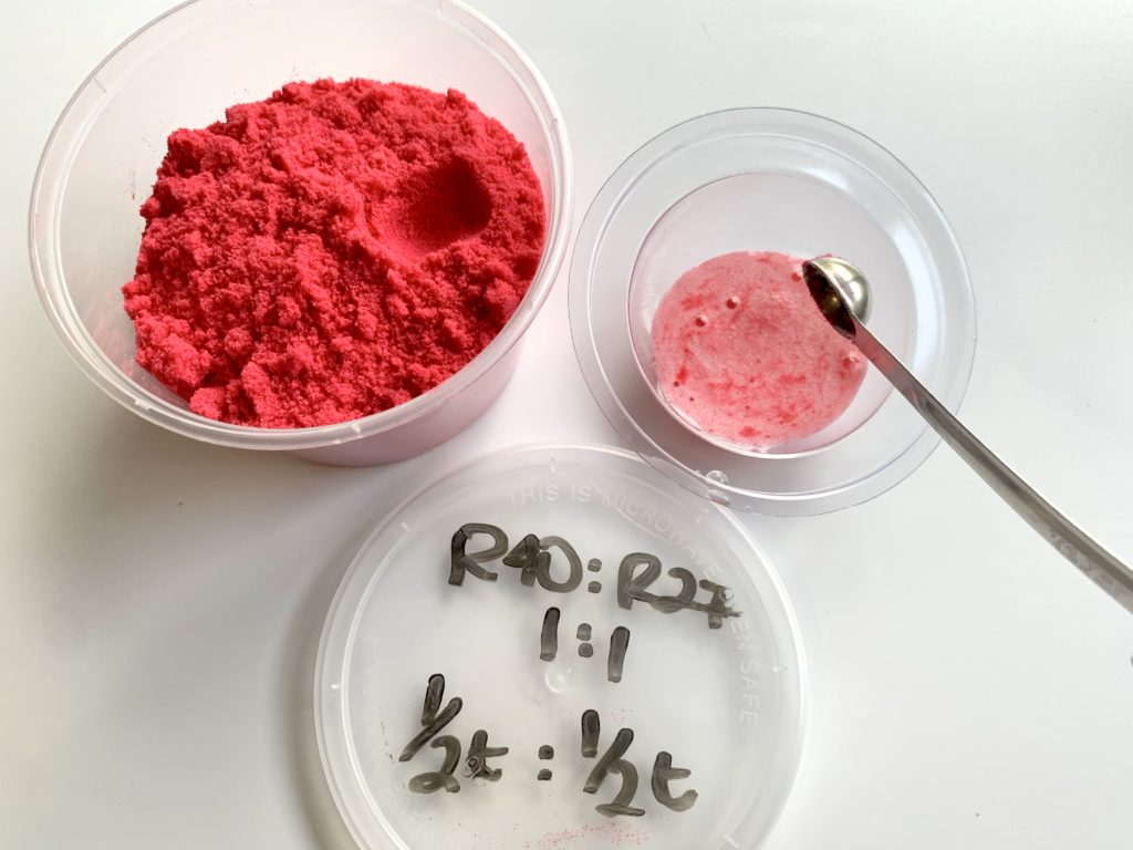
This is probably my favorite red blend! Red40 adds depth of color and staying power because it won’t fade as quickly as it’s friend Red 27, who is adding that pop of color that keeps this blend from looking dull and boring! The great thing about this blend is that the end water is a very true red color.
Mix 5: Red 40: Blue1 1:pinch!
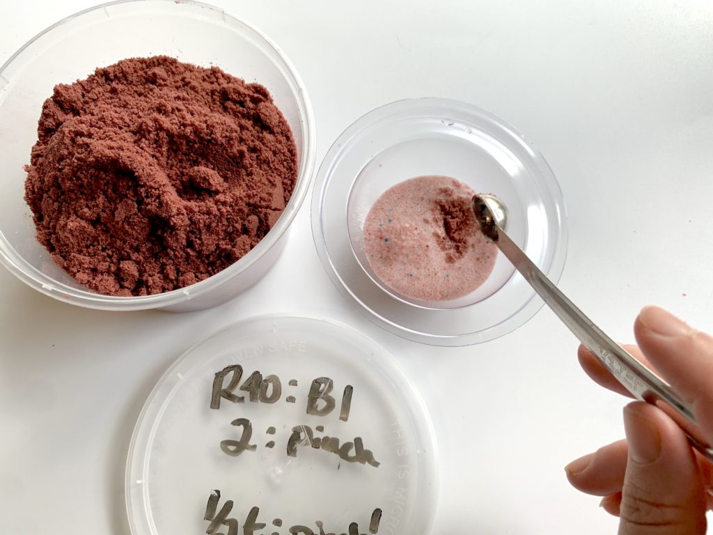
Why would I show you this blend? Well I live in a town whose high school’s colors are maroon and gold! If you ever needed to make a maroon, would you know what to do? If this was too brown for your preference, you could certainly add a bit more Red 40 to the mix. This is a great example of how using the different Lakes together could get you every color under the rainbow if you know how to mix them!
Here they are all together to compare!
So! Now you have a basic understanding of some of these blends, but how would you know which color blend you should use? For example, Mix3 and Mix4 seem pretty similar, so how would I decide which to use in a bath bomb?
If the bath bomb is solid, then it’s really about what you have on hand and prefer the ends water to look like. However, if you’re using other colors in your bath bomb, then you should always take into consideration that Red40 and Yellow6, when used in conjunction with Blue1, Red27 or Yellow6, will darken the end water. If you only use a tiny bit, then it will only slightly darken the water and might even be what you prefer. If, however, you need to use a lot of the Red40 you might end up with dark brown, or even black water. That’s one of the main complaints about rainbow bath bombs! So consider using one of these red mixes with little to no Red40, and you’ll be surprised at the difference it makes to the end water.
A NOTE ON LAKES:
Lakes are oil soluble and require the use of Polysorbate 80 in bath bombs. A good rule of thumb is to use an amount equal to half your oils. If you use 20g of oil, then use 10g of Poly80. Lakes are easy to use and blend because they can be added at pretty much any point in the bath bomb making process, and what you see is what you get. They don’t generally morph or change. They are cheaper than dyes, and therefore require more to be used to create the same color payout as dyes. When used from a trusted, high quality supplier, they can provide excellent color and bath art. Lakes are UV sensitive but not nearly as sensitive as dyes.
A NOTE ON DYES:
Dyes are water soluble and don’t require the use of Polysorbate 80. They can be bloomed in baking soda, added dry at the time of making, or pre-hydrated and added wet during the making process. They have a tendency to morph which can make color mixing a challenge. While dyes typically represent a larger initial financial investment, they last a long time due to their low usage rate and provide amazing color payout. Dyes are extremely susceptible to UV light and will fade quickly when left in the sun. The good news is that the bath bomb itself will still color the water, even when it has faded to almost white.
Do you want to learn more about colorants in bath bombs and bubble bars? We just launched Bubble Bootcamp: Color Masterclass!
Want to read more about the power of red?
https://www.scientificamerican.com/article/how-the-color-red-influences-our-behavior/
About Robyn French Smith

My name is Robyn French Smith! I studied fine art at the University of St Thomas and the Glassell School of Art in Houston TX, and graphic design at The Art Institute of Houston. I started dabbling in DIY bath and body products over 10 years ago after moving to Alaska. While I knew how to make basic soap for several years, I didn’t start looking at it as an art form until about 4 years ago when a neck and shoulder injury made it almost impossible for me to draw and paint. I needed a place for all that creativity to go, and I found it in soap. I received my Basic Soapmaker Certification from the HSCG in 2019 and plan on pursuing further levels of certification.
Find me online at scandaloussoap.com and Facebook!
Please share on Pinterest! Thank you!
You Rock Robyn
😊 Aww thank you!
Robyn, in your Humid ebook there’s a blend you mention for the example unicorn but you left out the ratio. I came here to see if there was a Red 40 / Yellow 5 combo but the closest I see is the red 27 / yellow 5 at least in your water test. A dear friend is a huge flamingo fan and I will be making bath bombs for her in that shape. Thanks