Orange is a universally comforting color. While we typically think of it as a color for harvest and autumn, it also represents the warmth and heat of summer, so nailing this color, and having a range of orange-tones in your wheelhouse is quite beneficial!
(View all of Robyn’s color studies here!)
In color theory, red is considered a color of passions and can also be abrasive and aggressive like a flared temper. Yellow, while typically associated with happiness, can be overwhelming and annoying when it’s used in excess. Orange however, tends to be a wonderful happy medium! It blends the heat of reds and the joy of yellows and lands in a welcoming, motivating and enthusiastic zone.
In the fall it makes us think of pumpkins, gourds, and the leaves changing colors on the trees. In spring and summer we visualize sunflowers, marigolds and monarchs!
When coloring bath bombs, orange is a really easy color to achieve, especially with Lakes. It has a bright bold appeal and is pretty hard to mess up. The one thing to watch out for with oranges is their tendency to be too yellow in the finished bath water. While this isn’t a huge deal, yellow is certainly one of the less appealing colors to bathe in. In this color study I’ll show you a few different ways to get great oranges, but even better, I’ll show you what kind of color payout you can expect.
If this isn’t your first color study, then you know the ropes when it comes to dyes and lakes and can feel free to skip my repetitive blabbing about the differences between these cosmetic colorants. If, however, you’re just delving into the wonderful world of cosmetic colors and you’re looking for a place to start, let me take a minute to discuss the differences between lakes and dyes!
A NOTE ON LAKES:
Lakes are oil soluble and require the use of Polysorbate 80 in bath bombs. A good rule of thumb is to use an amount equal to half your oils. If you use 20g of oil, then use 10g of Poly80. Lakes are easy to use and blend because they can be added at pretty much any point in the bath bomb making process, and what you see is what you get. They don’t generally morph or change. They are cheaper than dyes, and therefore require more to be used to create the same color payout as dyes. When used from a trusted, high quality supplier, they can provide excellent color and bath art. Lakes are UV sensitive but not nearly as sensitive as dyes.
If you’re needing a good supplier, I like to get my lakes from (affiliate link) MakeYourOwn.buzz.
A NOTE ON DYES:
Dyes are water soluble and don’t require the use of Polysorbate 80. They can be bloomed in baking soda, added dry at the time of making, or pre-hydrated and added wet during the making process. They have a tendency to morph which can make color mixing a challenge. While dyes typically represent a larger initial financial investment, they last a long time due to their low usage rate and provide amazing color payout. Dyes are extremely susceptible to UV light and will fade quickly when left in the sun. The good news is that the bath bomb itself will still color the water, even when it has faded to almost white.
I guess I should also take a moment to say that while I love micas, and while they will color the body of your bath bomb or bubble bar mix, they won’t color the bath water itself. When used in massive amounts they might add a little tint to the water, but honestly, if you’re expecting orange bath water after using orange mica you will be a sad little bather. Micas are awesome for painting bath bombs and play such an important role in our ability as makers to creatively express ourselves, but leave it to Lakes and Dyes to do the heavy lifting!
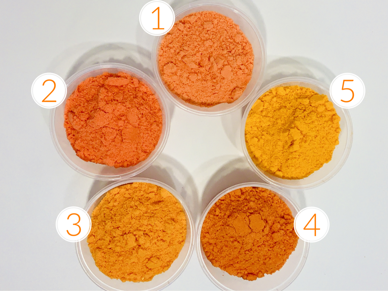
If you’ve read any of the other Color Study blog posts, then you know that I like to work with ratios. Ratios are a simple way to express how many parts of one thing there are to another. The reason I like to work with ratios is that they are easy to scale up or down. Each of the sample batches I show contain 250 g of bath fizz mix. You can add more color according to the scale of your mix.
For example, my batches weigh approximately 2,280 grams. If I loved the color combo of Mix 1 and wanted to replicate it, I would scale it up about 9 times (2,280 divided by 250 = 9.12). Which means instead of ¼ tsp of Yellow 5 I would use 2¼ tsp of Yellow 5… and instead of ⅛ Red 27 I would use 1⅛ tsp of Red 27. It also means if I wanted to just do a half batch I could still easily accomplish this color without guessing at what the final color would be!
Okay, enough chit chat! Let’s see that orange!
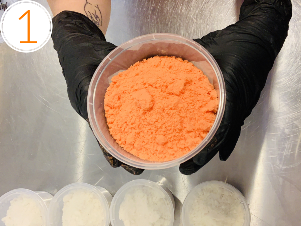
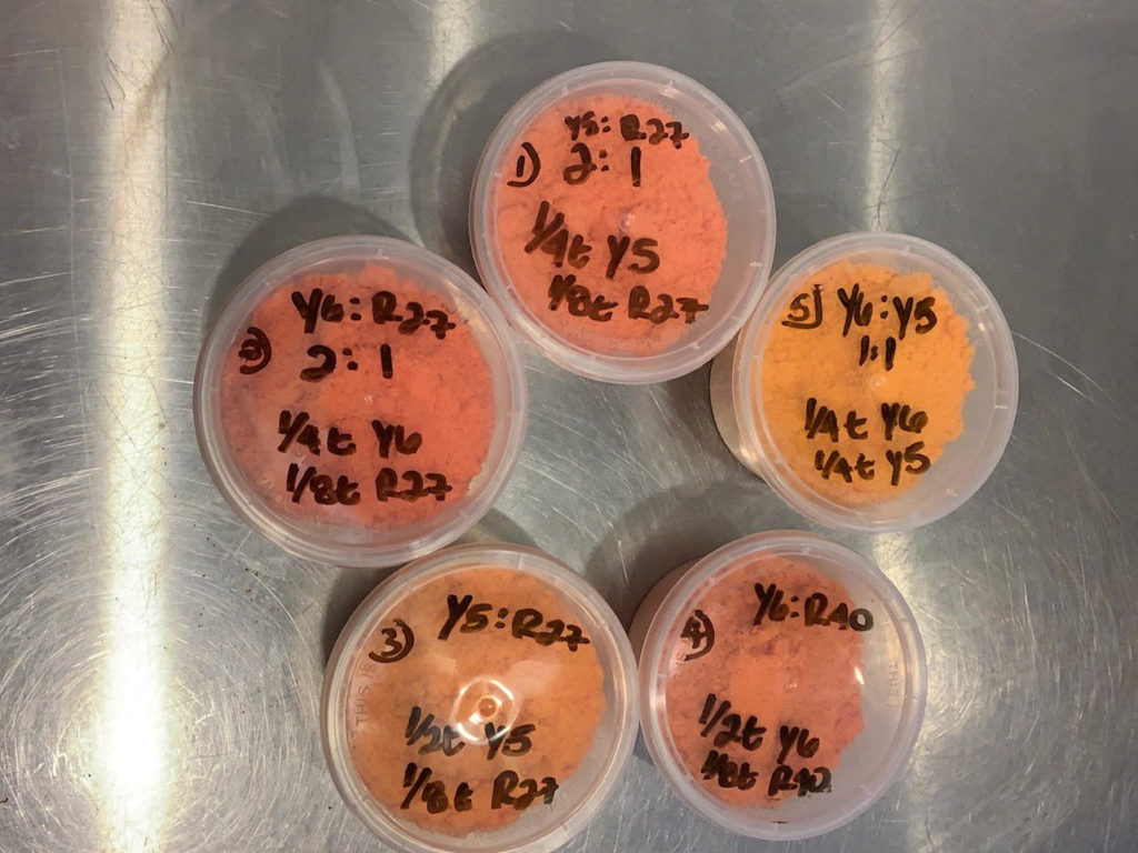
Mix 1:
- Colors: Yellow 5: Red 27
- Ratio: 2:1
- Actual Used: 1/4 tsp Y5, ⅛ tsp R27
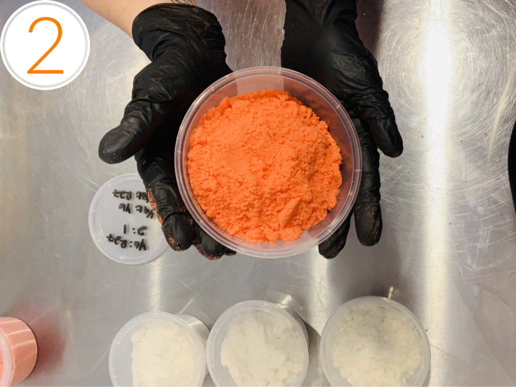
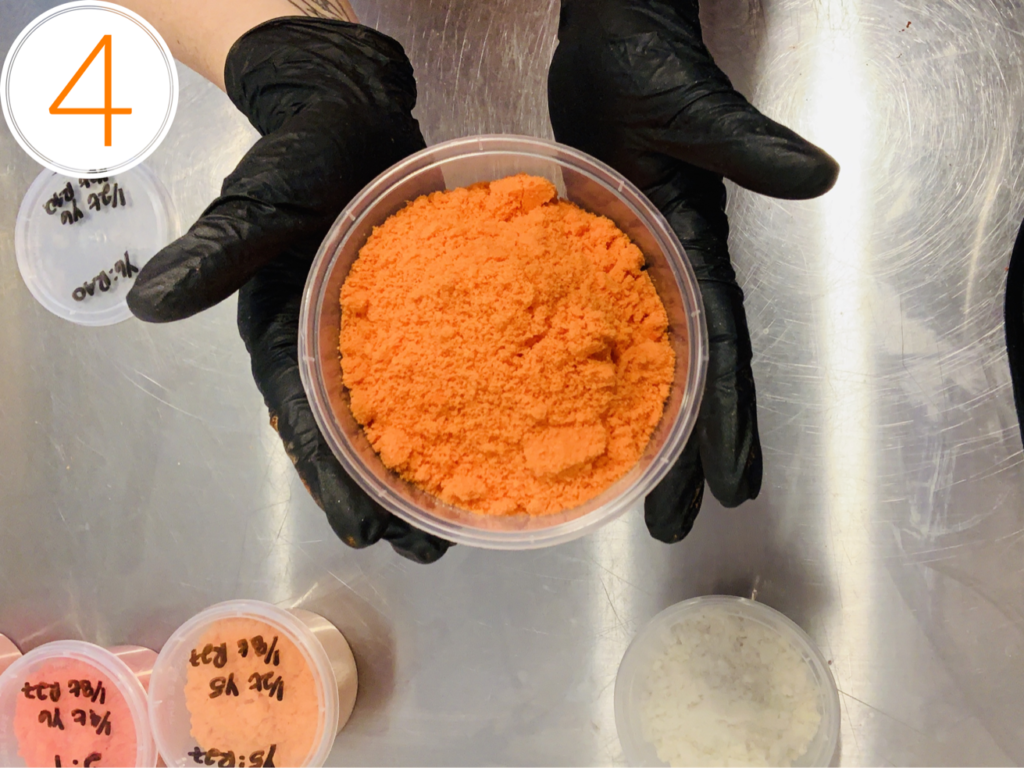
Mix 2:
- Colors: Yellow 6: Red 27
- Ratio: 2:1
- Actual Used: ¼ tsp Y6, ⅛ tsp R27
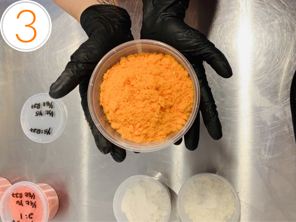
Mix 3:
- Colors: Yellow 5: Red 27
- Ratio: 4:1
- Actual Used: ½ tsp Y5, ⅛ tsp R27
Mix 4:
- Colors: Yellow 6: Red 40
- Ratio 4:1
- Actual Used: ½ tsp Y6, ⅛ tsp R40
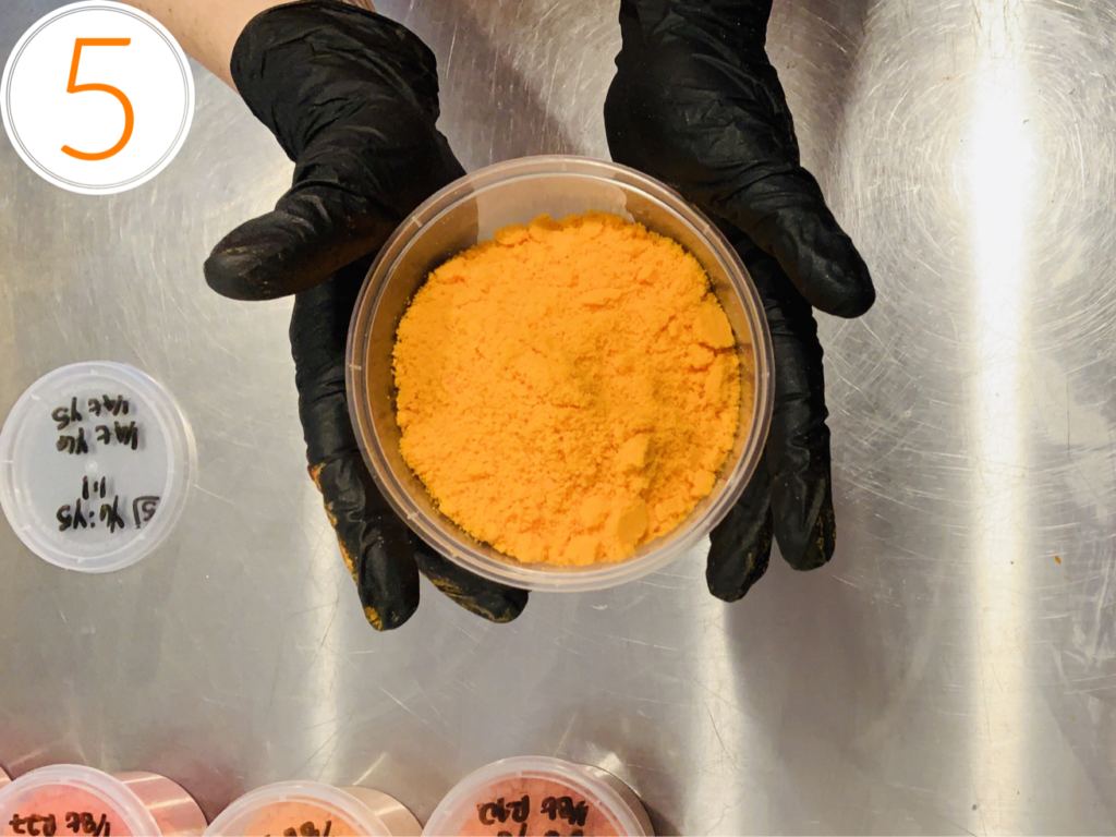
Mix 5:
- Colors: Yellow 6: Yellow 5
- Ratio 1:1
- Actual Used: ¼ tsp Y6, ¼ tsp Y5
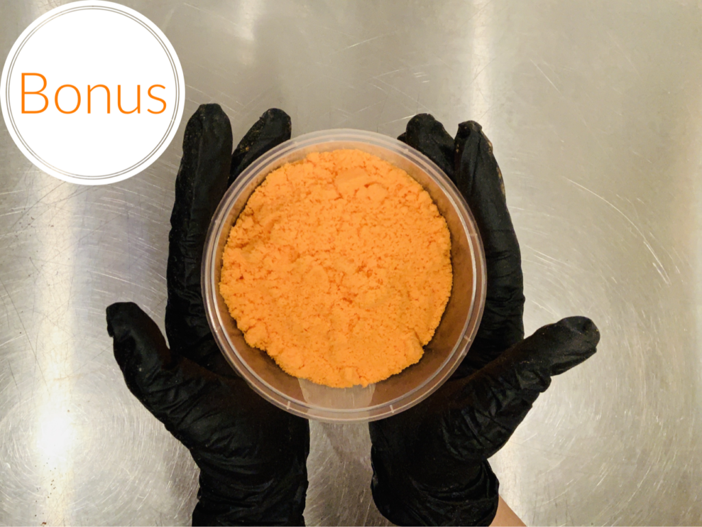
BONUS:
- Colors: Yellow 6
- Ratio: solo
- Actual Used: ¼ tsp
Here they are all together to compare!

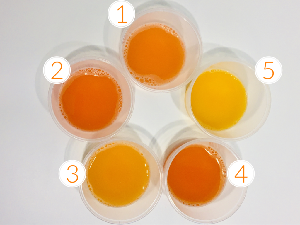
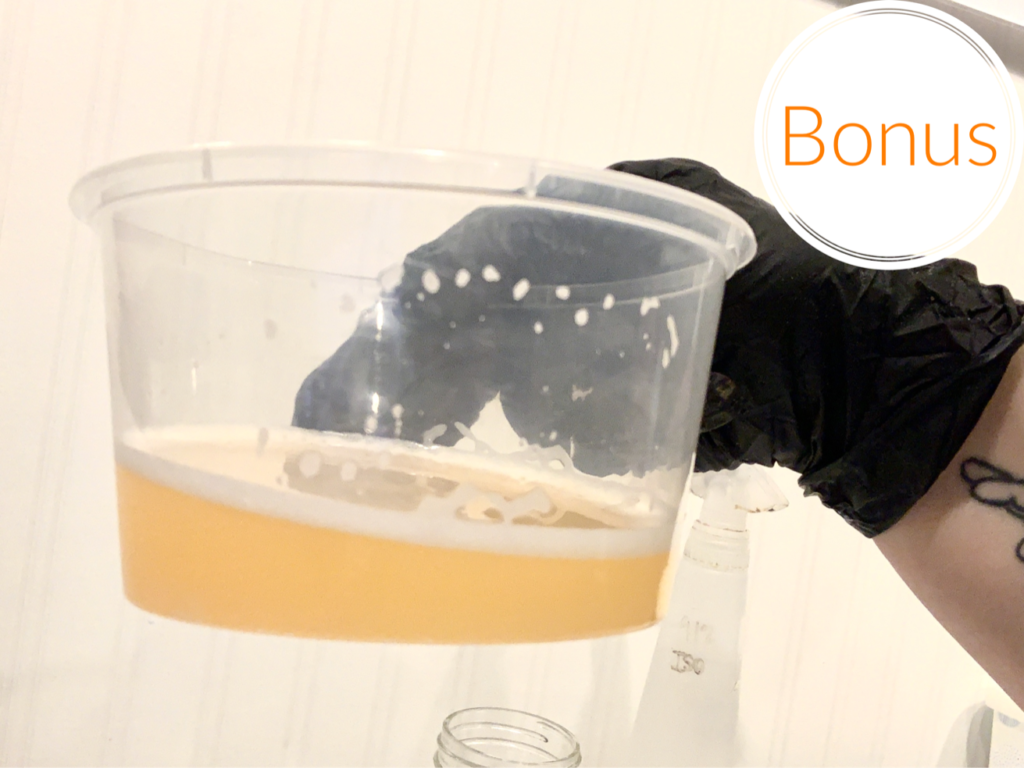
Many people see Yellow 6 sitting there in its happy little jar looking for all the world just like orange. Once in the water though, a bath bomb colored with just yellow 6 alone doesn’t tend to have that wow factor. The color payout just isn’t as vibrant as you’d expect when looking at the finished product. I love to combine yellow 5 & 6 when I want to get a brighter pop of color, but of course you run the risk of the mix being too yellow and looking like… pee. There. I said it.
Sorry. We all were thinking it though.
What is interesting is that Mix 1 is closest in color to the Bonus color when it comes to the dry mix. So, in a finished product, these two would look almost the same and it would be really hard to tell the difference between them. The final water color however is vastly different!
The goal of these color studies is always to create content that helps other makers achieve their creative vision. Knowing how to mix your own colors, or how to achieve the same final color with different mixes, is such a powerful tool! We hope you continue to explore, innovate and share!
Do you want to learn more about colorants in bath bombs and bubble bars? check out Bubble Bootcamp: Color Masterclass!
About Robyn French Smith

My name is Robyn French Smith! I studied fine art at the University of St Thomas and the Glassell School of Art in Houston TX, and graphic design at The Art Institute of Houston. I started dabbling in DIY bath and body products over 10 years ago after moving to Alaska. While I knew how to make basic soap for several years, I didn’t start looking at it as an art form until about 4 years ago when a neck and shoulder injury made it almost impossible for me to draw and paint. I needed a place for all that creativity to go, and I found it in soap. I received my Basic Soapmaker Certification from the HSCG in 2019 and plan on pursuing further levels of certification.
Find me online at scandaloussoap.com and Facebook!
What about Y5 and R40? What would that produce? Why Y5 and R27? Thanks!